![[Ad-Swipe] Simple Ad With Powerful Imagery](http://createmoregood.net/wp-content/uploads/2017/09/20150527_143135.jpg)
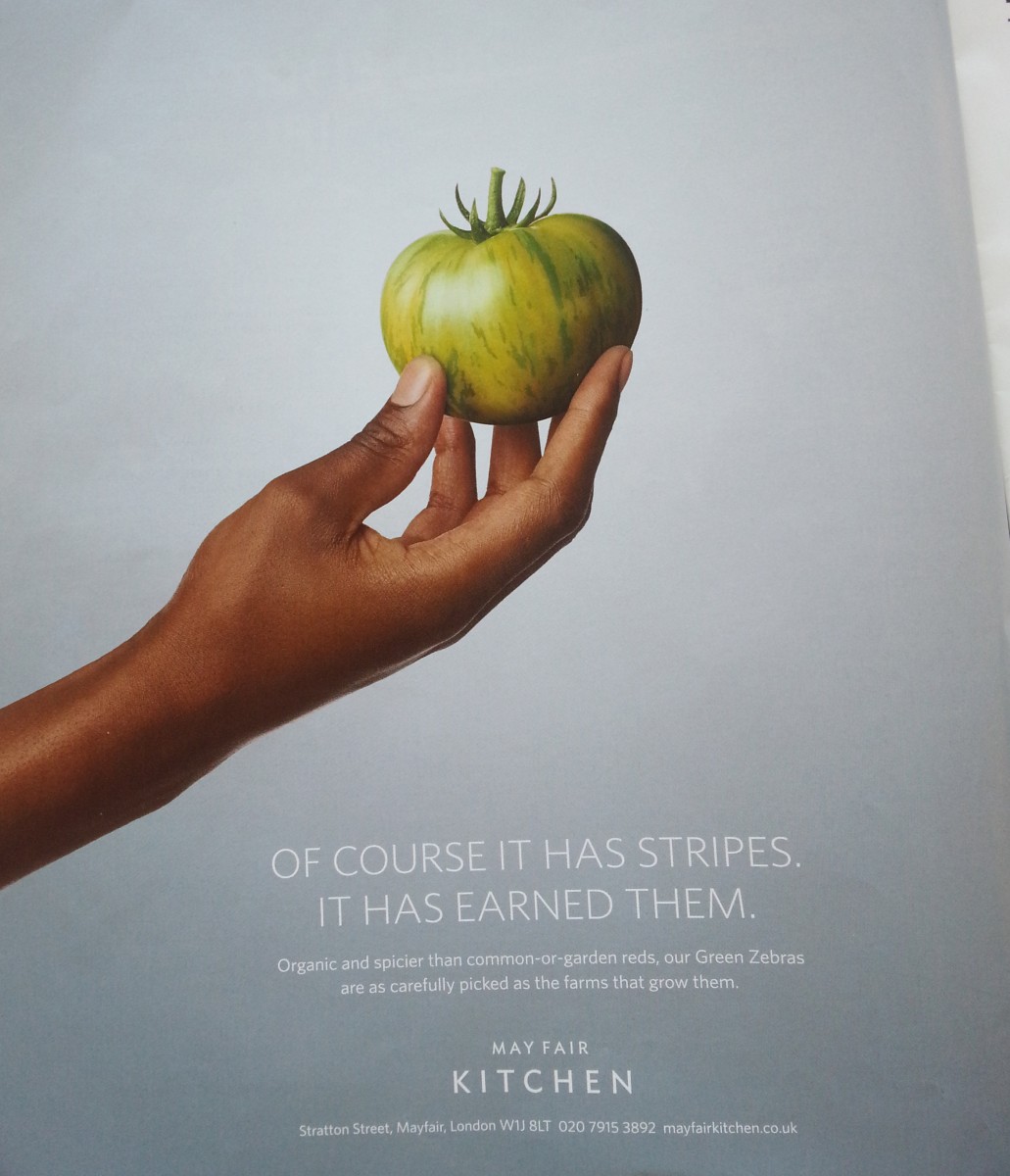
Here’s a smart little advertisement from May Fair Kitchen, a higher-end restaurant based in the UK that centers their cuisine around locally-sourced fresh ingredients.
Nothing incredibly new in terms of position, but still a powerful statement on the experience they’re providing.
The advertisement is part of a pair of print ads that focuses on their connection to source for their restaurant.
In this case, a Green Zebra tomato.
While I’m not 100% on the headline, I really enjoyed the body copy they put together with a very clean image.
The copy visually pairs well with the image, being simple, clean, and to the point.
My favorite line: “…are as carefully picked as the farms that grow them.”
Not only does that line give a tiny bit of education on the variety for those of us who aren’t tomato aficionados, they’re adding more depth and connection between their connection with the farms.