Standing Out In A
Crowded Marketplace.

Every industry is facing new pressures brought on by technology, though few were harder hit than the photography world’s swift change from film to digital. 

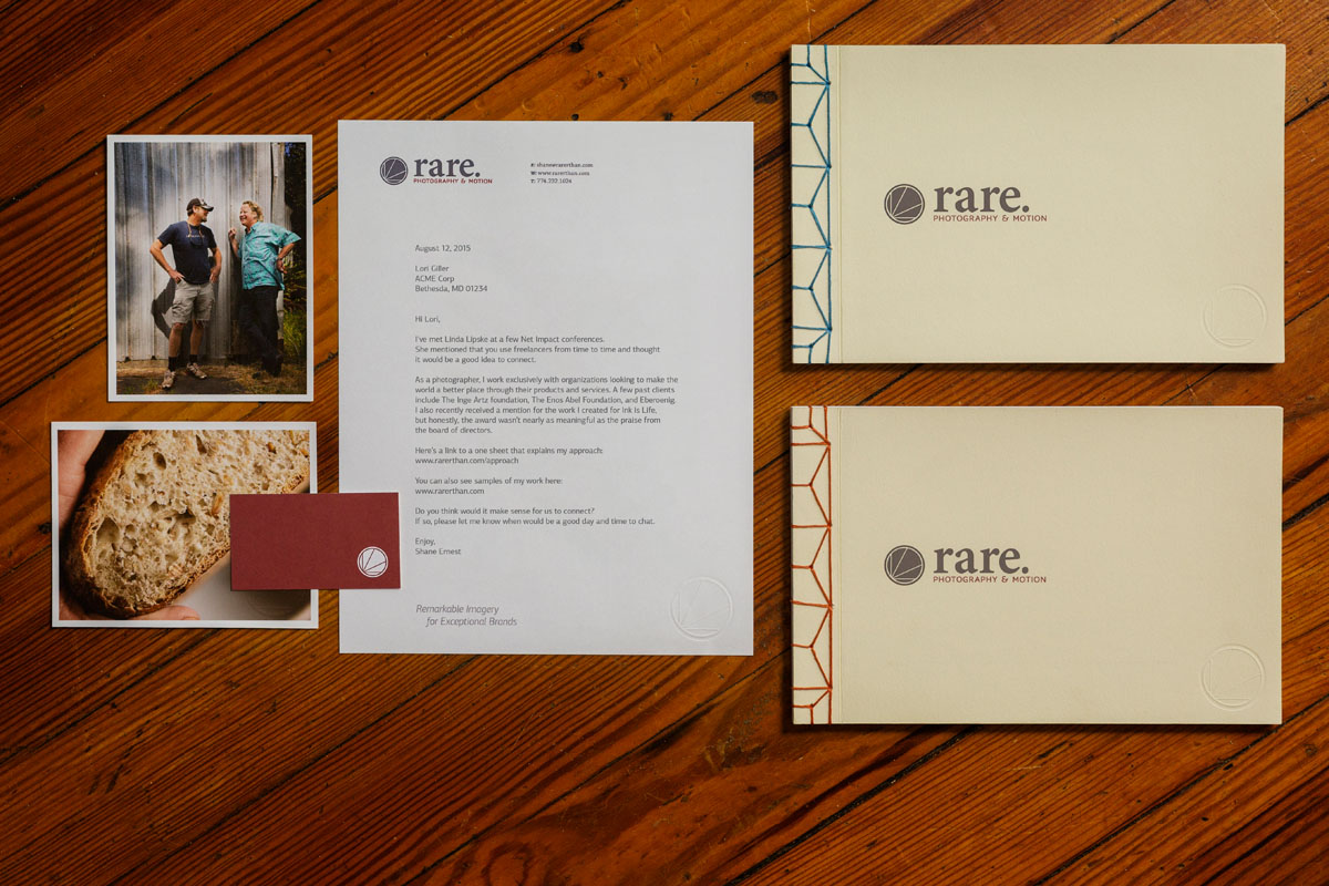
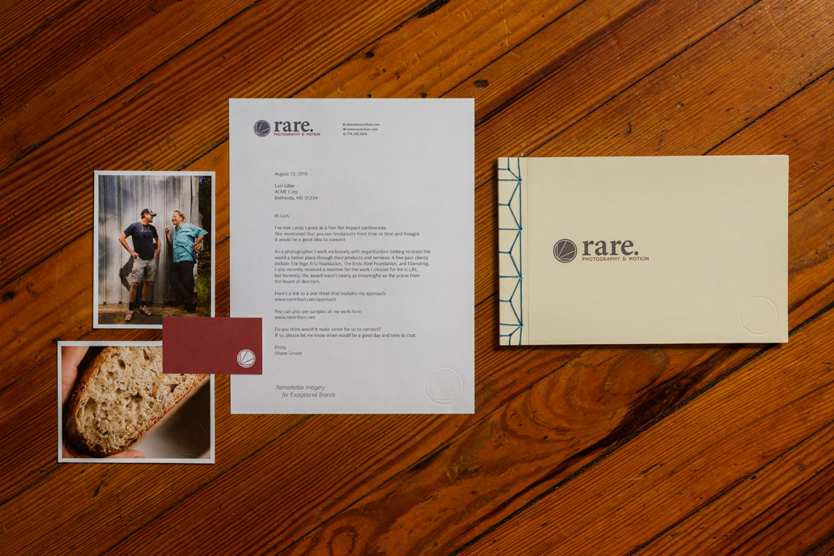
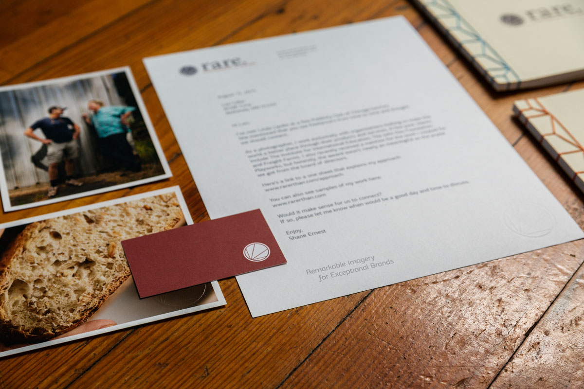
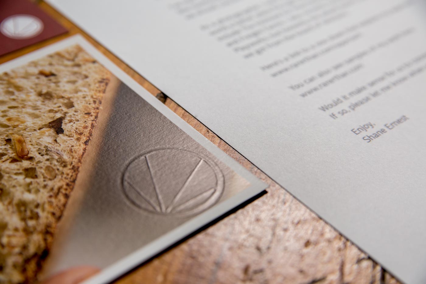
In order to help our sister business, rare. stand out in the crowded commercial photography space, we chose to develop a brand that showed a strong appreciation for high-quality, consideration for the environment, and the goals of our change-making clients.

Laying The

Groundwork.

The commercial photography space is notoriously crowded,  experiences art buyers and even VPs of marketing are bombarded with wave after wave of photographer promos.

By choosing to focus our marketing on high-touch and building personal relationships, we knew that our most important touch points would be the materials that we share directly with our clients; handwritten letters, leave-behind promos, and our custom-built portfolio books.

That’s why we developed an affordable branding platform that let us transform any printed material into a communication piece that felt anything but affordable.

Staying

Memorable.

After having our partner turn the logomark into a embossing die, we now had a flexible and affordable way to extend the brand to anything in print.

Choosing heavyweight paper added a visceral sense of strength, stability, and quality to every printed piece, and with the addition of our embossed logo, every aspect of the brand came together in a memorable way.

The paper choice in our other materials matched the same high-quality approach we took to printing and binding our photography portfolios. The end result being a 22-page, Japanese bound portfolio book that felt personal and rare.

Branding and Design
For Rare.

Liked This Project?

Check out the video we made for a unique bakery in Northern California.

Happy to Help.

Follow the link below and we’ll set up a time to find ways to put smart creative to work for your brand.